Usability measures how convenient and easy a product is to use and how well it solves user problems—critical in the mobile-first era where poor mobile usability causes users to leave quickly and hurts search rankings
Six core usability principles: (1) strong first impression (3-second rule, clear USP/CTA), (2) quick element identification (minimalist design, familiar naming, accessible fonts), (3) standardization (consistent patterns, atomic design systems), (4) distinct interface status (element responses, user control), (5) quality flow (proper navigation, helpful hints, error prevention), and (6) flexibility (multiple paths to same action, personalization options)
Measure usability through conversion rates—how many users complete target actions; conduct usability audits when problems arise, but ideally research target audience and work out UX logic before building the site
Poor usability means wasted time and money—investing in user-friendly design from the start prevents costly redesigns and helps users complete desired actions in your sales funnel
What is usability
The word "usability" is formed with two root words, "use" ― to use, and "ability" ― an opportunity. This reflects a crucial meaning: usability as a notion determines how convenient it is to use a particular object, how easy it is to master, and to what extent it can solve the user's problem.
For example, imagine a playground. You can consider the playground's usability from different angles, and it's used by two primary groups of people:
By kids, as the site has many slides and space for a large number of children to play.
By the kids' parents, as apart from letting children play, they see it as a place where they can rest, chat, and look after the kids when they play.
Both these use cases can be applied to a playground. Of course, the kids' and the parents' ideas of playgrounds' convenience will differ, and each of them will aim to achieve different goals while being there.
An example of what usability is for
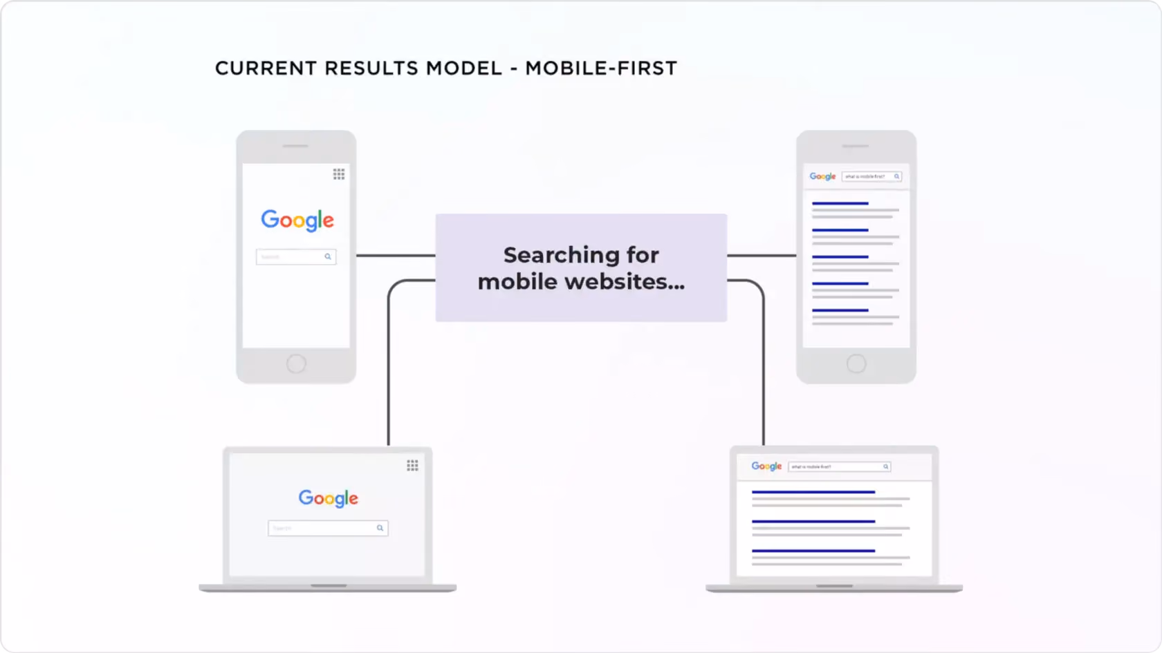
In 2015-2017, analysts noted a turning point in the traffic distribution between mobile and desktop versions of mobile devices. This led to a new trend called "mobile-first". Its essence lies in the priority of developing the mobile version, while the work on desktop view may be postponed.
The mobile-first principle is derived from a simple premise. If the website does not have an adaptive and convenient version, it becomes challenging to look at, and the user eventually leaves. Search engines do not tend to offer inconvenient-to-view pages, so they initially give priority in ranking to sites optimized for viewing on mobile devices. However, if the website optimized for mobile traffic is inconvenient to view, the guests will quickly leave it. The quicker the users leave the site, the worse the user experience gets.
The conclusion is that ignoring the convenience of your potential customers will not give the desired result (or even make it difficult for them to find a site on the Internet).
Six usability principles
When creating a product, the aesthetic is not only the component that matters. You must make an understandable and convenient interface for the person using it: this rule is the essence of usability.
Before starting a project, determine the target audience. Think about who will use the product, what are these people's needs and expectations, and what factors will influence their decision-making.
In the 1990s, Jakob Nielsen, Ph.D. in Physical Sciences, Nielsen Norman Group founder, established ten usability principles, calling them heuristics. Although invented decades ago, they remain relevant to this day and can be projected on modern products, as they comply with UI best practices.
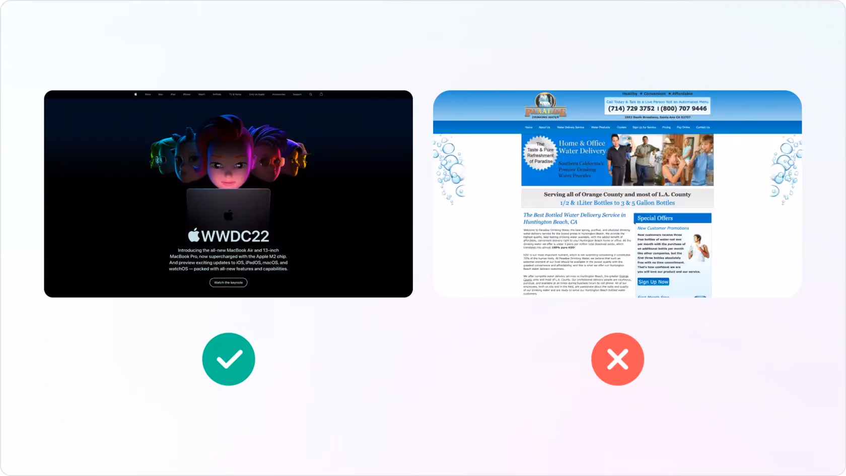
1. First impression principle
1
3-seconds rule
The 3-seconds rule is responsible for the first and the most crucial impression. As you could probably guess, it constitutes that the user's first impression is formed within 3 seconds of looking at the website. That's why it is crucial to make this page understandable. In this aspect, the following questions should be answered:
is it obvious to users what is the purpose of the page they are staying on?
how users can navigate and act on the page?
where can they find the needed solution?
2
USP, CTA, Benefits
A professional product should clarify what solution is offered, its essence, and why it is better than the competitor's offer. That way, target users can easily evaluate the product according to the criteria that matter to them.
Study your audience carefully and determine which standards are important to these people. Putting your competitive edge into the USP will make it more attractive to those who care about that selection criterion
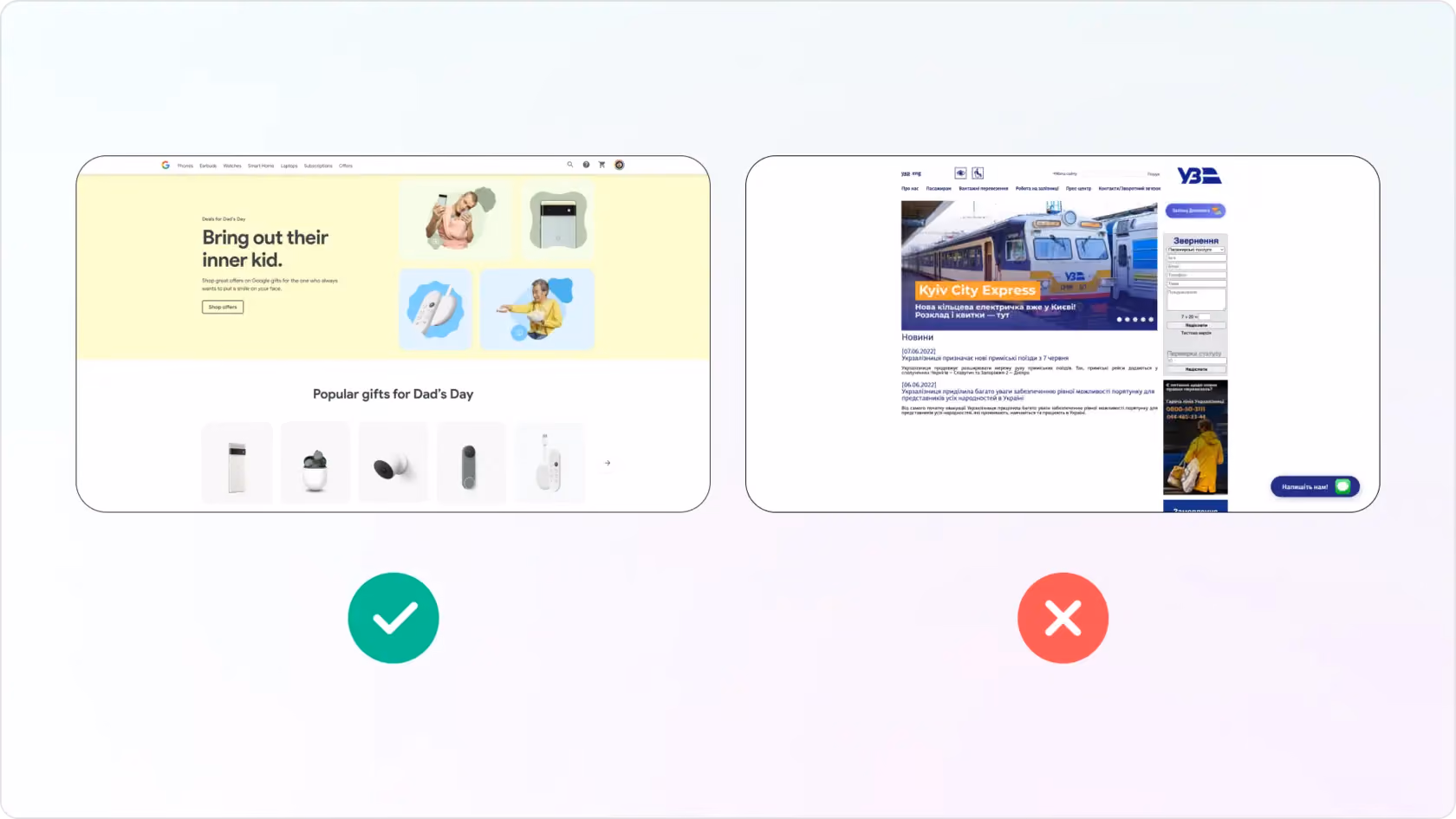
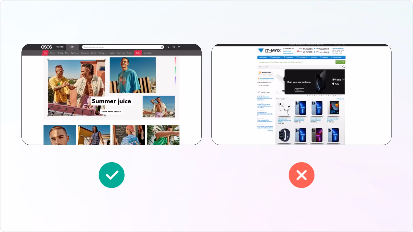
2. Quick identification of elements
1
Aesthetic and minimalist design
The interface must respect the ratio of value and emotional information. At the same time, it can consist of text, visual elements, animation, or even sound effects. Violating such a ratio leads to a decrease in the visibility of more important information.
It is imperative to set priorities correctly. Avoid excessive decorations that confuse users and prevent seeing the key element they are looking for. Follow Occam's razor principle: if one interface element is removed and comprehending information is still possible, the job can be done without this element.
2
Habitual naming for the target audience
The design should speak in an understandable language using words and phrases familiar to the user from his daily life and not use internal jargon that can lead to a dead end. For information to be displayed in a natural and logical order, it is necessary to follow the common user's logic. People can predict how the system works, based on their own personal experience with similar resources. The interface should help them in every possible way.
3
Product Visualization
A well-built interface allows the user to comfortably navigate the product, whether it is an application or a website. The first questions designers should always ask themselves:
does the image help the user make a decision?
does it provide value?
If not, then it is easy to get confused by such an interface, and this solution should be rejected.
4
Accessibility
Accessibility is the quality of the digital environment, characterizing how it is adapted for people with disabilities and situational limitations. Imagine a situation: the user forgot eyeglasses, and due to the designer's decision to use a very small font size, he or she experiences difficulties interacting with the product. That's why accessibility matters.
3. Standardization
The most important consistency is meeting users' expectations on how an element works or a particular task is resolved. People should not wonder if different words, symbols, situations, or actions mean the same thing. For instance, if you use a green button for a CTA, it should be green on similar elements throughout the site. If the user begins to think hard while visiting the page, fearing taking the wrong step, it means that the design system is not developed well enough.
1
Interface Sequence
The less the user's memory has to be engaged, the better your website's interface. Interface elements should be named, look, located and function in accordance with the user's expectations. The sequence is important here.
For example, in online stores, the basket is usually located in the upper right corner and, at the same time, has a specific icon by which the user immediately recognizes it. If the basket is marked with a new icon or placed elsewhere on the site, the sequence will be broken and will not meet the user's expectations. This will be too unusual for the user, which may cause them to leave the site.
2
Hidden Items
Hidden elements save time for both the designer and the user. The designer does not need to invent new interactions ― looking at how certain applications are made is enough. The user doesn't need to think about how certain functions are arranged.
For example, a user has long known that switching to the next user's story on Instagram simply takes swiping left. This hidden element has long become familiar, and there is no need to emphasize it every time. If the designer needs to make an application similar in functionality to Instagram, they should look at how the hidden elements of these services are arranged.
3
Atomic Design System
The rule refers to maintaining consistency within a product. Here is an important atomic system in which the interface is not designed as a whole but is assembled by details (or "atoms" ): buttons, colors, icons, input lines, animations, etc.
This is how modular pages and blocks are formed, which, if necessary, are easily corrected: just replace, change or remove a particular element. Adhering to design systems makes work easier and meets the target audience's expectations.
4. Distinct interface status
1
Element response
The obligation of any website's design is to inform the user on what is
happening at the given website right this second. All interface elements
should immediately work out the clickability state (using color changes
or micro-animations) so as not to cause confusion to anybody.
2
Control and communication
Open communication between the system and the user allows them to
understand what is happening and make decisions according to the
situation. For example, if a person is tracking an order in the app,
they should be able to see the status (location, arrival time) and
cancel it.
The system should allow the user to feel in
control ― it impacts whether or not your target audience will use the
product in the future.
5. Quality of the flow
1
Disclosing necessary information
Did the promised action happen after the click, and did the user receive
an expected result? Has the user been provided with the information and
tools needed for each step of the process?
When creating a
script, it makes no sense to waste the time and resources of future site
visitors. It is necessary to show only information helping people
understand what they will find helpful for themselves at this stage of
the flow.
2
Navigation
The rule is primarily based on the logic of transitions. For example,
"breadcrumbs" should correctly redirect the user ("home" should send to
the main page, not to the basket).
It is also worth
remembering the 3-click rule: can the user reach the desired location in
three steps? You should always consider that a person can mistakenly
make a few extra mouse clicks or finger presses ― this barrier should
not be present in your interface. In addition, the site must be adapted
to achieve the final goal in different ways ― no matter how the user
goes to the desired information, they should easily reach it.
3
Help and hints
Help and hints will allow the user not to get confused in your
interface. It is vital to give suggestions where they are really needed.
For example: how to recover a password, how credit is made, which
products have already been viewed, which ones have been added to
favorites, etc.
4
User control and freedom
Users often perform some actions by mistake and do not find the
necessary information. This can lead to leaving the website. That's why
it's so important to create a backup plan where the user can quickly get
out of the wrong action rather than going through the extended and
painful process of closing tabs and refreshing pages.
5
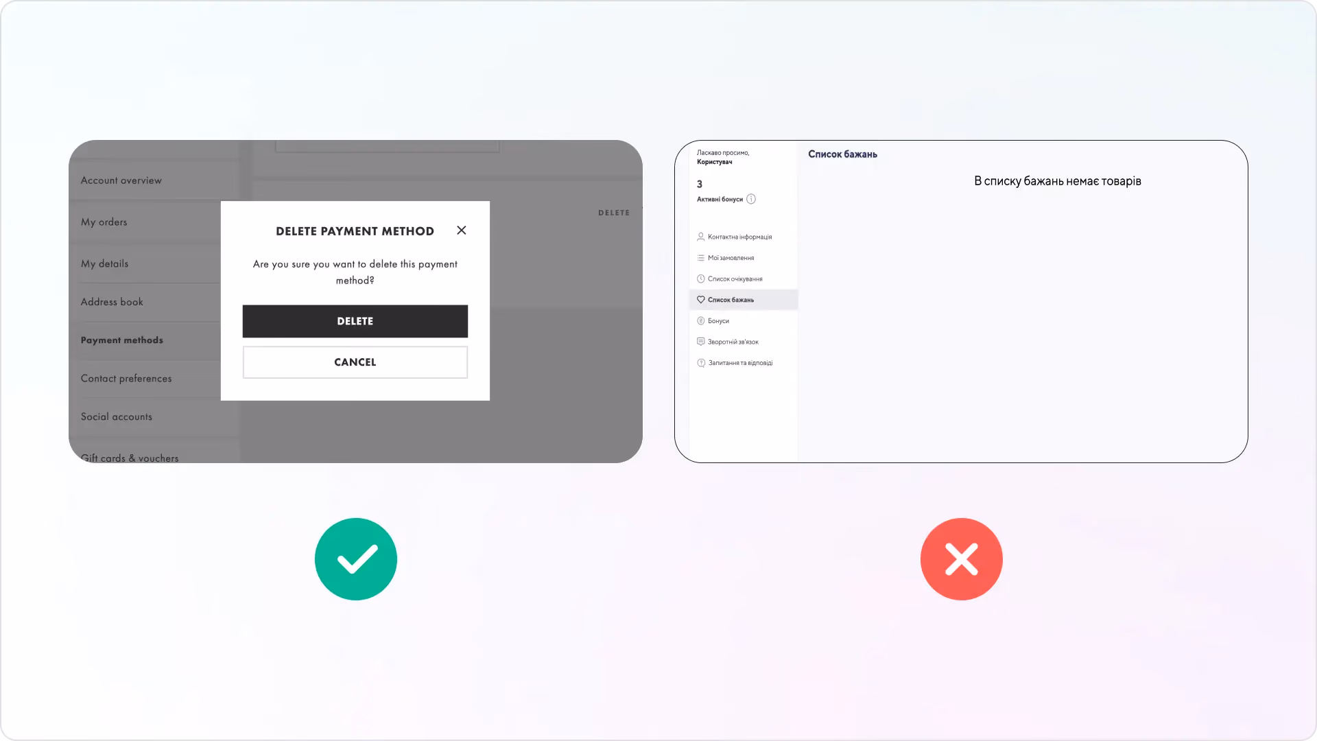
Mistake prevention
If the user is prompted to confirm the action, this helps them avoid
unwanted problems. For example, a person mistakenly clicks on "delete,"
but the information is critical to them. To avoid unnecessary panic, the
user should be preventively asked: do you really want to delete this
data?
6
Error messages
Errors should be expressed in plain language and pinpoint the problem,
offering a constructive solution. For example, if the page the user is
looking for doesn't exist, the interface should offer to see the catalog
(in the case of online stores).
6. Flexibility and efficiency of using the interface
It's essential to provide the user with multiple paths to perform the same action. For example, to duplicate some text in the browser, you can press the right mouse button and select "Copy" and then "Paste here." Alternatively, you can perform an action using accelerators: use the keyboard shortcut Ctrl + C and Ctrl + V. Basically, it's the same action executed differently. This approach allows choosing the method of action that seems most convenient.
It is also worth considering a personal approach: add filters, searches, and a choice of configurations that help the user form an exciting offer and adjust the flow independently.
Ways to measure usability & what usability audit
The website's usability should be measured by conversion ― namely, <medium>how many users performed the target action<medium>. It can be making a purchase, leaving a request, or subscribing to the newsletter, depending on the site's goal.
If the resource has problems, experts conduct a usability audit. This analysis allows you to determine what prevents the user from completing the target action on the website.
In website development, determining usability should be at the project's concept stage. There is no website yet ― and the logic (UX) should already be worked out. And only then the interface elements (UI) are adjusted to it.
It all starts with researching the target audience
who are they;
what are their tastes;
what are the motives for using the product the website offers;
what doubts and fears are associated with its use
All these steps will form the decision basis ― what will be the easiest way to convey the business offer, bypassing the fears and eliminating all the doubts the target consumer experiences.
A usability audit is carried out later after the website has been launched. But the main work takes place at the beginning of the project development. So the owner of the future resource saves time, effort, and money by investing them in a working, practical concept based on user experience. If user experience research is carried out after implementation, you risk having to completely rework the project, change the concept and logic of the website steps, and redesign the website.
Resources to help you measure whether your product is user-friendly or not
Maze
Usabilla
Optimizely
Usabilityhub
Userbrain
Fivesecondtest
Google Analytics
Conclusion
Complying with usability principles and good UI design are the basic essential of any web project. If the site is difficult to understand and the user cannot find the right information quickly, they will most likely leave and not perform the targeted action you need them in order to start their way in a sales funnel. Providing a user-friendly interface is not only an essential part of brand representation but a milestone on the path to a successful business.
If you want to create user-friendly interface for your project, Freshcode specialists are always glad to help you. We have been selected as one of the Top UI/UX Design Agencies in London by DesignRush, so you can be sure that your interface will meet all usability standards.